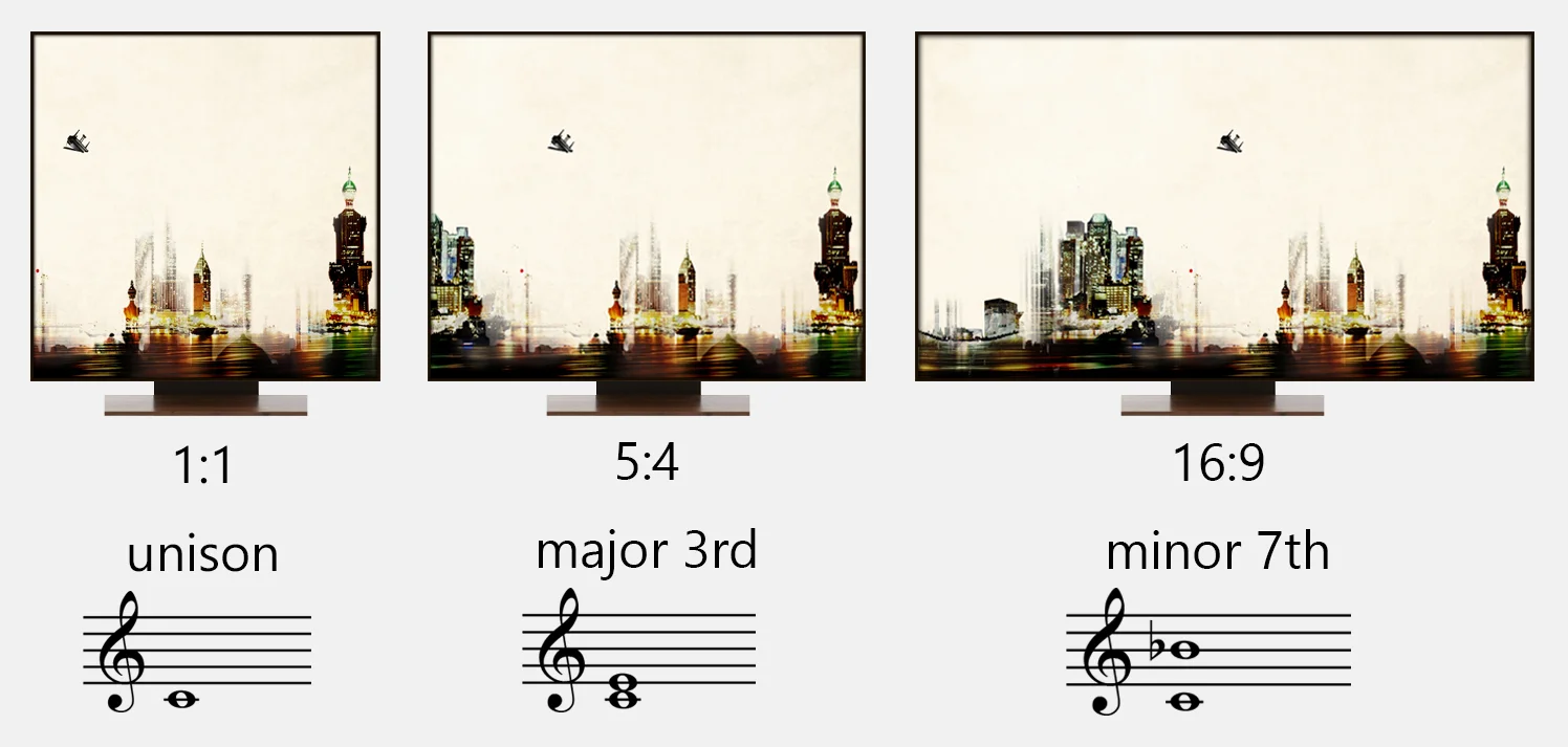
Different screen aspect ratios and their equivalent in music / Photo from Lisan Al Tarab album cover.
I noticed something extremely interesting while I was refreshing my memory about frequencies in the musical scale. There’s a striking similarity between interval ratios that compose the scale and the aspect ratios used for TVs, computers, cinema and photography.
What blew my mind even more was that the current aspect ratio used in the widescreen cinema standard is mysteriously related to the old Pythagorean tuning.
Scientists and mathematicians have been forever looking for hints and clues to what makes humans perceive certain things as beautiful and other things as not. The “golden ratio” aka “the divine proportion” is famously believed to have extraordinary appealing characteristics and has kept engineers and mathematicians obsessed with its qualities since Leonardo Da Vinci. However, the world around us is full of other proportions that work well with our perception of beauty and evolution is constantly proving how human perception is adaptable to change. What was once regarded as dissonant is now regarded as agreeable and the cycle continues.
If your ears like it, your eyes must like it too
We describe our perceptions based on what we feel, taste, see, hear or smell whereas the five senses are only mediums and the true perceiver is the mind. Therefore if something sounds good, it should also look, smell, feel and taste good. In fact, how many times have you heard somebody say: This music feels so great?
“While the aspect ratio of an image is the proportional relationship between its height and its width, an interval ratio in music is the proportional relationship between the frequencies of the notes in a scale.
In other words, a screen has an aspect ratio of 4:3 when the width is 1.33 times the height and an interval of two notes has a 4:3 ratio when the frequency of the note above is 1.33 times the starting note (Do - Fa for example).”
Here are 8 of the most used aspect ratios and their equivalent match in music intervals:
4:3
Back in the silent film era, William Dickson from Thomas Edison’s lab chose the 4:3 ratio for film and it managed to remain the cinema standard for 60 years. The reasons why he went for this ratio in particular are not certain but what is interesting is that 4:3 is the second most important interval in music and it is called the subdominant. This interval is the fourth (IV) and it’s highly consonant quality makes it very pleasing to the ear.
4:3 screen
3:2
If you've tackled any subject related to acoustics and/or music theory, you would know how important the 3:2 ratio is. If we multiply the frequency of any note by 3:2 we will get the fifth (V) above that note. For example middle C has the frequency of 261.6 Hz which when multiplied by 3/2 yields 392.4 Hz, the frequency of G, a fifth above.
The fifth interval is called the dominant and is the most important note in the scale after the tonic (starting note). This ratio is not only considered to be the backbone of harmony, it is also the backbone of rhythm and in my previous essay I demonstrate how a 3:2 rhythm transforms into a 3:2 interval when we apply enormous speed to it.
4:3 in music is closely related to 3:2; in fact an inversion of a Perfect Fifth interval gives us a Perfect Fourth an octave lower. Simply inverting 3:2 and multiplying it by 2 (to bring it up one octave) gives us 4:3 (see figure 1).
In cinema, both ratios are closely related in the same way. Doubling a 4:3 frame would yield a 3:2 frame when you turn it 90° (see figure 2). The 3:2 aspect ratio was very popular as well as it was the format for 35mm film and the standard for digital SLRs.
fig. 1 (click to enlarge)
fig. 2 (click to enlarge)
1:1
1:1 screen
Let us not forget the quintessential 1:1 ratio. This classic square image was very common back in the day. We’ve seen it for decades on LP and CD covers but it recently reached an unparalleled popularity due to the billions of Facebook profile pictures and as the only available aspect ratio on Instagram.
In music, the 1:1 ratio is called the unison and its effect is heard in classical Arabic music, for example, when all the violins are playing the same note.
Rectangle Blues
By comparing the above-mentioned aspect ratios to scale ratios we find that we are looking at the root of the scale (1:1), the fourth (4:3) and the fifth (3:2). In fact, this I-IV-V progression is the most widespread harmonic progression in the history of music and it is found in almost all musical genres around the world. The Blues for instance, which shaped a whole new era in music and influenced genres such as jazz, rock, pop, RnB and country music, is based entirely on just those three chords.
Just for the fun of it, here is how would a 12 bar blues progression look like if drawn in rectangles:
12-bar blues in rectangles
I = 1:1, IV = 4:3, V = 3:2
16:9
This is a C7 chord made up of screen aspect ratios
Click to enlarge.
The exact similarity between screen and scale ratios for the above three specific cases does not surprise me at all. I have gotten used to finding 3:2 pop up everywhere that I’m usually more intrigued when I don’t find it.
What did catch my attention, however, was something else. The screen aspect ratio has passed through a lot of changes until it recently settled on the widely used 16:9. The popularity of HDTV has solidified 16:9 as the most important aspect ratio used today especially that it is the format used by YouTube.
A man called Kerns H. Powers first proposed this in the 1980s and he found that by overlapping popular aspect ratios, they all fit within an outer rectangle of ratio 16:9. The value Powers found turned out to be exactly the geometric mean of 4:3 and 2.39:1 (more about this ratio below).
In music, 16:9 is also an interval, the minor 7th in a musical scale and even though this interval is considered non-consonant in acoustics, it adds substantial beauty to a chord as it acts as a natural extension to the chord after the I, III and V. It also occurs naturally in the overtone series (the 7th harmonic) and is one of the most defining sounds in blues and jazz. Along with the minor 3rd, the minor 7th is also a blue note.
More ratios
I’m no expert in the evolution of TV and computer screens but I've come across various ratios that were used along the way and all are found in the musical scale:
5:4 early TV format is the equivalent of the Major 3rd in music.
8:5 common computer screen is the equivalent of the minor 6th.
5:3 common European widescreen is the equivalent of the Major 6th.
“Dissonant compositions are therefore deliberately structured to evoke a sense of incompleteness. Just as there is a strong wish to straighten a picture hung crookedly on a wall, a well-structured dissonant shot will evoke the same feeling of a composition seeking to achieve balance. The friction and conflict that is set up can convey a strong sense of unresolved tension as well as creating interest and involvement.”
Pythagoras and the cinema screen
The industry standard aspect ratio used in cinemas today is called Anamorphic and its ratio is 2.39:1. My first reaction to this number was: why 2.39? It doesn't look like any familiar number whereas I always assume that no number is ever chosen randomly. I honestly have no idea why the film industry decided on 2.39 but whatever was the reason, I was so hoping to have a "happy ending" for my research by matching the ratio of the anamorphic screen with a music interval.
It was clear from the beginning that 2.39:1 does not look like any of the 12 chromatic scale ratios and I failed to match it with one. Even though this came as a disappointment I surely wasn't giving up so easily, so I thought about this: All the observations I’m making are based on the ratios of the Equal Temperament (more about temperaments here) but what if I compare with old temperaments such as the Pythagorean tuning which has the same 12 pitches tuned in a different way than how the tuning is standardized today. To my surprise, the Pythagorean minor 3rd interval is tuned to the ratio of 32/27 which if multiplied by 2 (an octave higher) would yield the ratio of 64/27 which equals to 2.37:1.
This means that the Pythagorean minor 3rd is deviated from the anamorphic screen by 0.019:1 which is less than 1%!
--- Update (16 Feb 2015): I added this text below following a valuable observation made on this essay on twitter by musician Brian Prunka:
Brian was wondering why I went to compare the anamorphic aspect ratio with the Pythagorean minor third while I could have stayed with the Equal temperament tuning and got an even better approximation. It strangely escaped my attention that a minor third in Equal tuning is 6:5 which if multiplied by 2 yields 12:5 which equals to 2.40! That's obviously much closer and almost exact by 0.4% making it the "happy ending" I was looking for but for some mysterious reasons my brain hid the number right in front of me.
The Anamorphic screen, as it turns out, is equivalent to the minor 10th interval. Unlike the fourth and fifth intervals, melodies containing the minor 3rd (or 10th an octave higher) are generally known to sound sad, emotion-full and melancholic and their almost exact equivalence to the cinema widescreen seem to perfectly justify the visual purpose.
anamorphic widescreen with ratio of 2.39:1, the current cinema standard; almost equivalent to the minor third (2.40:1).
Click photo to enlarge.
There are a lot of vague speculations about why Dickson and Edison chose to go by 4:3 for the screen in 1889. Same with why committees decided to go by 2.39:1 for cinema and not 2.40:1 for example. There’s no doubt that the reason for a widescreen format is related to the human eyesight visual angle in some way or another but there are no concrete scientific reasons that explain those proportions in specific. In my opinion, the aspect ratios’ exact resemblances to music intervals affirms that coincidence is less likely an answer, especially that 1:1, 5:4, 4:3, 3:2 and 16:9 are not just any random notes of the scale, they are the intervals that rank high in terms of “importance” among all 12.
Now that we can visualize the shape of music using rectangles, I can’t help but wonder: How does a melody smell like?
- Tarek Yamani
Credits:
Cityscape photo is from the cover of my album Lisan Al Tarab: designed by Valerie Nseir.
John Coltrane, Miles Davis, Cannonball Adderley & Bill Evans photo from Kind of Blue session: photo by Don Hunstein
Sources:
Picture Composition for Film and Television – Peter Ward
An Introduction to Historical Tunings - Kyle Gann
http://digital-photography-school.com/aspect-ratio-what-it-is-and-why-it-matters/
http://en.wikipedia.org/wiki/Aspect_ratio_(image)
http://www.cinemasource.com/articles/aspect_ratios.pdf
http://en.wikipedia.org/wiki/Anamorphic_format
Brian Prunka's website: www.nashazmusic.com
Find me on:
Twitter: http://twitter.com/tarek_yamani
Instagram: http://instagram.com/tarek_yamani
Facebook: http://facebook.com/tarekyamani
Soundcloud: http://soundcloud.com/tarekyamani
Youtube: http://youtube.com/abottoot


